

My eyes ate better than my belly
The French Exit, Brisbane.

I’m always biased by the beauty of a restaurant. So when a place sells me a story before I’ve even tasted a thing, I want to know: can the room keep the promise the brand made? We booked this beautiful new French restaurant that opened 6 months ago in Brisbane, one of the latest creations by the talented Anyday hospitality group, that I genuinely love for the way they build unique stories around places and food every time they open a new venue. My designer eyes were sold long before my hungry belly had a say. Which is exactly the experiment: what happens when you walk into a story?
When I first came across The French Exit, it was on Instagram, this is my new place, as for many of you, to find out about new local restaurants, especially now relocating to a new city myself. This blue ink illustration of the face of this heritage building on a white background appears on my screen. I couldn’t see at first the subtle animated blue door that teases you to come into their world. A caption making you a promise: you will travel to a Parisian bistro, the perfume of butter and wine, duck à l’orange, a huge selection of wine that will definitely seduce your soul. It did in fact satisfy my French heart.
They build up the excitement by sharing a second post, a pleasing video clip with a loud background noise — people chatting, cutlery that clings together — inviting you to experience the place in an audible way before showing any food yet. They build up the experience from curiosity, to audio, to now a third post with finally their food. A warm-toned picture of a modern and refined version of steak tartare, perfect round egg, potato chips, on a marble table, with their logo subtly appearing on a glass of wine at the back. A seduction sequence, post by post.
I almost started to feel hungry, but I got really sold on this place when the first picture of the interior was posted. I liked it, and I got it.
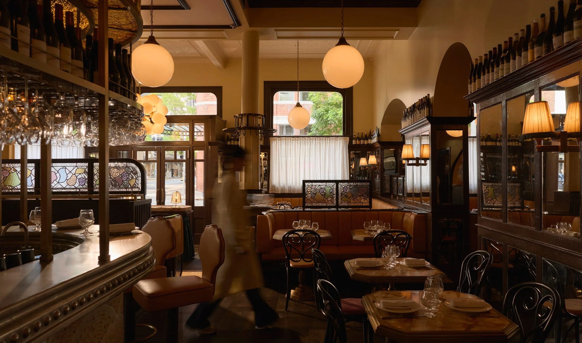
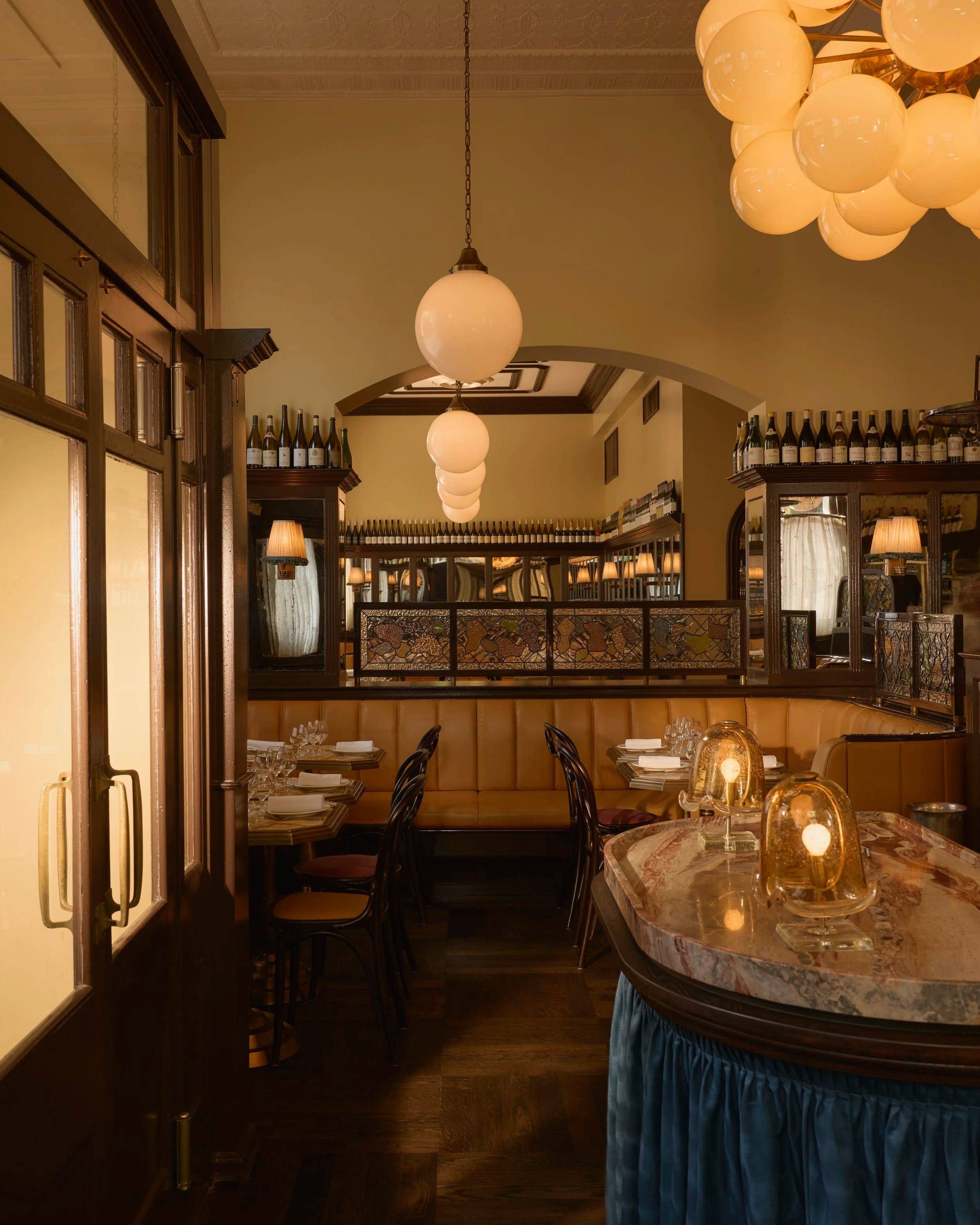
I feel instantly back home, in a noisy brasserie, with this banquette in leather, the place you like to take as a kid because it’s always the most comfortable seat to pick in a restaurant, the little mid-light sheer white window curtains that bring you just enough of the outside world to keep you in the Parisian atmosphere inside. Then I saw the stained glass. They got me at this: art deco vibes of abstracted marron, green and soft pink shapes, framed with a deep brown wood, the same colour and material that reminds me of the uncomfortable bistro chairs that will hurt your back but are so familiar that you will forget about them (because your food was delicious). Every detail inside of the restaurant was impeccable and deep. You wouldn’t imagine that from the street, where the restaurant arbore a wrought-iron canopy and a dark timber door: classic, but inviting you to look through the window.
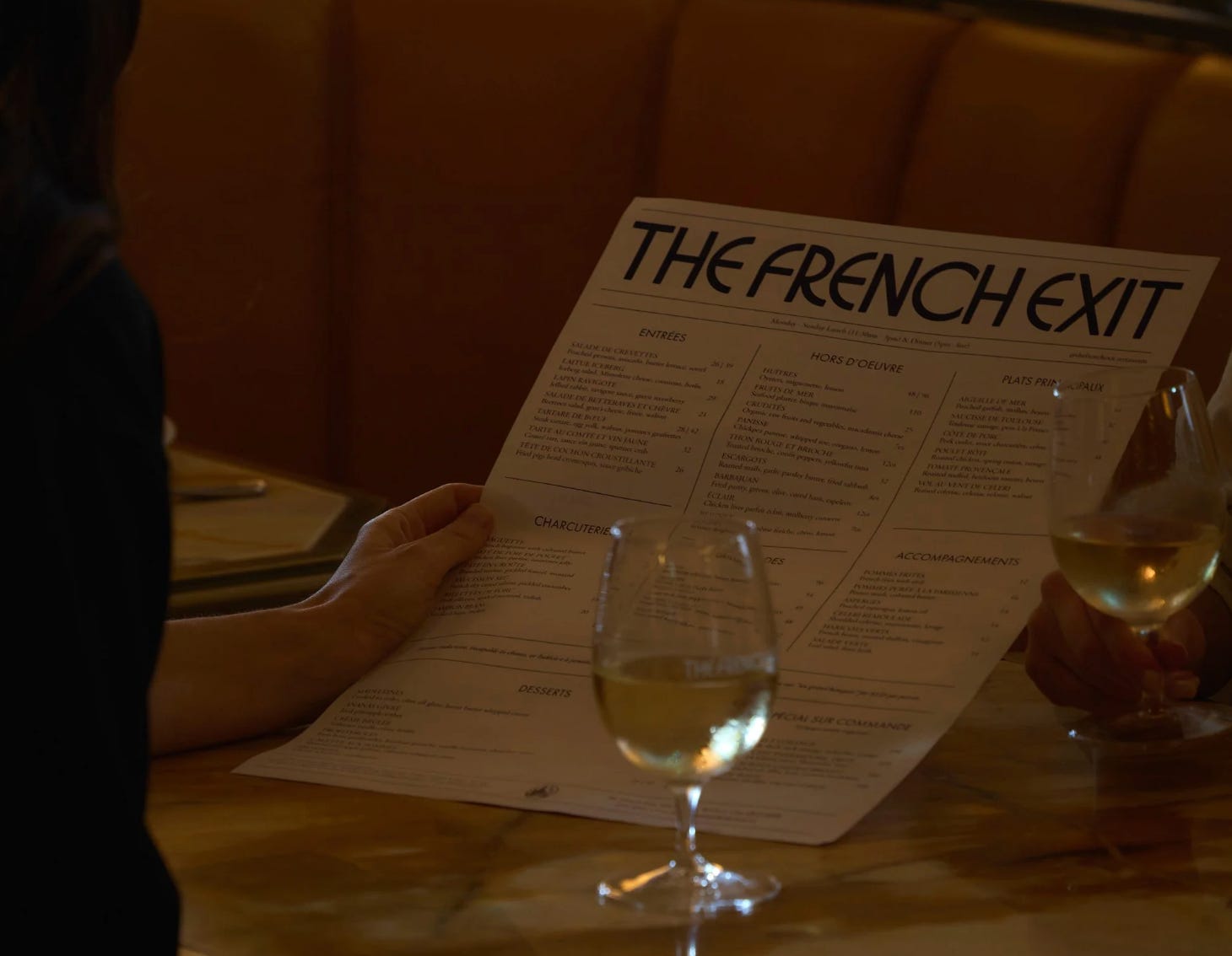
By now I’m already sold by the interior work by Tamsin Johnson, but don’t get me started on their branding (which is my favourite part, as always). I found their logo first displayed on their menu in the street, after passing a few times in front of the restaurant thinking I really wanted to come and eat some French food and then I’m just attracted even more by their beautiful wordmark. This bold blue rounded font, a curved geometric display sans in the French Art Deco tradition, very much descended from 1920s–30s poster lettering (think Cassandre’s vibe). So clever, it’s bridging the right cultural period identity. The exaggerated vertical proportions with a very tall cap height, near-monoline strokes, and those eccentric letterform decisions: the low-slung crossbars on the E and F, the tiny counter on the R, the H with its dropped bar. There’s also a slightly unicase, hand-lettered irregularity to it (the N and X feel almost drawn rather than typeset), which is very on-trend for contemporary deco revivals. The menu text is doing the opposite job: a classic old-style serif (Caslon or Garamond adjacent), set in letterspaced small caps for the dish names with roman or italic for the descriptors. That’s a very traditional French bistro convention, so the pairing logic is: eccentric deco display voice for personality, quiet bookish serif for credibility and readability.
The overall effect is that “modern nostalgia” positioning Parisian brasserie heritage filtered through a contemporary graphic sensibility. I loved it. The brand had made me a promise: come in, sit down, eat, have a good time.
Well. It’s now time to book, and walk into the story.
When we came to the restaurant, there was this big first door: the one I spoke about twice already, because it plays a central feature between the street and the restaurant. Once in, you definitely get the mood set up: the lights are low, the curtains closed, and I noticed the single small golden and very cute lamp on each table with their fabric abat-jour. Before we sat, I picked a few business cards left on the main counter, my takeaway memory before the moment started. The shiny coated paper has a slightly off vibe to it but practical, for my greasy fingers to come after I snuck a few small bites.
We sat at our pre-selected table, just behind the large counter and if I could have chosen, I would never have picked this one: straight in the middle, losing a bit of intimacy, plus getting the wind in my neck from the large open door anytime a new guest was coming. A small table, really close to the next one, and we were secretly hoping nobody would take our neighbour’s seat. The proximity leaves you a bit less room for deep conversation but that’s okay, I’m here to eat. And here is the first small crack between the story and the seat: the brand sold me ease, and the room was already asking me to negotiate for space.
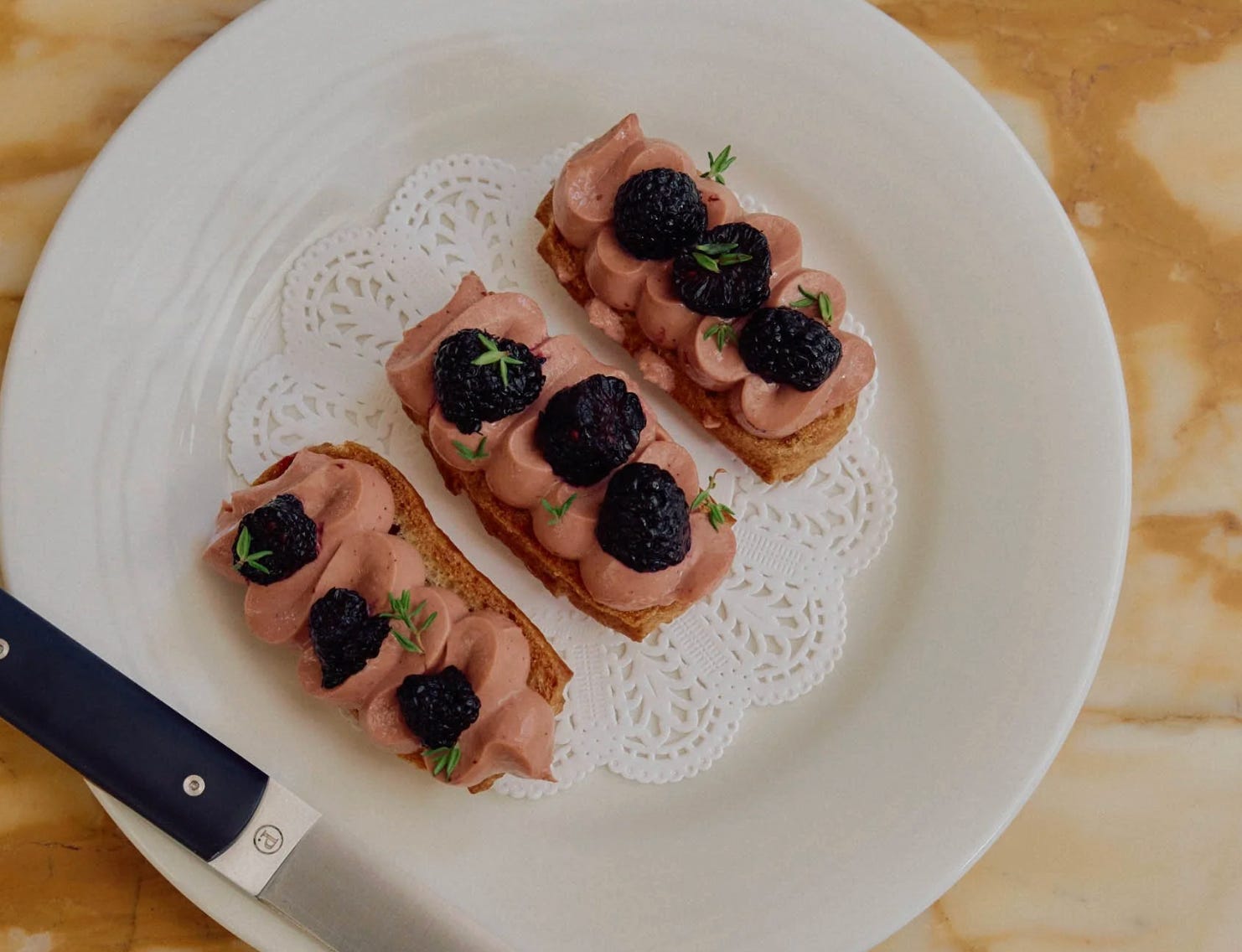
Our first waiter came, a lovely French gentleman, with a sense of humour, just not too much, to make it a bit “forced cringe French” and handed us this huge A3 menu à la carte. Beautifully presented, well designed. But definitely a bold move for such a small table. We already knew what we wanted, so this was quick. We were so excited about a few dishes, especially the small éclairs with chicken liver pâté. (who would have thought?)
We ordered the cocktails, then the hors d’oeuvres (a small dish even before the entrée), and it already took up the whole space of our section (I told you the table was too small or we were too ambitious). Anyway, there was a problem here. I couldn’t fit the really cool coaster under my glass, nor keep my fork near my plate without having to move the bread, the sauce, the brioche, the salad, the escargots… (I would add a plus for the branded butter, molded with their logo).
There were just too many large plates, and I didn’t feel comfortable at my table. I was worried about knocking something over, but I didn’t want to speed up to finish my plates either, I wanted to enjoy the experience. The table was getting fuller, the space stayed limited, and this was really throwing off the flow of eating in this nice set-up. And that’s the strange part: everything else was keeping the promise. The curtains, the stained glass, the little lamp they built the world I was sold on Instagram. But sitting there, moving my bread to make room for my fork, I kept getting pulled out of it.
I got hooked by the vibe, bringing me to eat at The French Exit with a certain expectation. I appreciated the service, the interior venue, the attention to the storytelling, the branding itself but I didn’t get to live the experience the way it was sold to me. The food never got the stage the branding built for it. The gap wasn’t between the menu and the plate. It was between the story and the seat.
Back home, I put the business card on my desk.Somehow, that card is the most honest souvenir of the evening, the brand in my hand, the dinner already fading.
À bientôt,
Mary