

When branding sets the Bar too High
Or how I fell for a restaurant's branding before tasting the food and what it taught me about expectations.

Five years ago, I became the unlikely co-founder of a pastry business.
Me someone with no real background in hospitality. No serious passion for food (at least not then), and barely two years into running my own freelance design studio. French by birth, sure, so maybe pastries were always in my blood. But I didn’t grow up dreaming of opening a café or a restaurant. I didn’t have a grand hospitality plan. I just fell into it—alongside my fiancé—and we started something.
Today, that something is a pastry shop on the east coast of Australia, in the center of a small coastal town. We’ve been open for two and a half years now. And while it takes up a huge amount of my time, energy, and headspace: t’s also shaped how I see the world. Especially as a brand designer.
I don’t look at hospitality the same way anymore.
I notice the menu layout. The quality of the greeting. The music. The chairs. The smell. The dust in the counter. The way the food is plated. The details that feel intentional or not. And of course, the branding. To which I now pay double the attention.
In fact, I probably judge a bit too much. I’ve found myself in situations where I chose a restaurant purely based on how strong and beautiful their brand identity looked. Without even checking the menu.
We live in a time where image often comes first even before taste or quality. That applies to restaurants too. Branding can elevate, seduce, and persuade. But it can also mislead.
Not long ago, I passed by a new fine dining spot and instantly fell in love… with the branding.
Before even stepping inside, I was intrigued. The whole identity felt intimate, confident, and quietly luxurious. The aesthetic was dark and cinematic, with a coastal edge not breezy or beachy, but tactile and grounded.
Think: deep burgundy walls, raw concrete, black and white accents, touches of red. A bold, unfussy logo that felt architectural and assertive. The use of blur, grain, and negative space suggested mystery, restraint, exclusivity. It all spoke to craft, to refinement, to something serious.
And I bought it. Without looking at the menu, we booked.
Through the window I saw the chef working behind the counter. A few tables were already full. The place looked alive and focused. Beautiful, Tasty, Intriguing. Let’s go, I said.
We were seated at a beautiful marble counter, right in front of the small open kitchen. Pots were on the stove. Fish were hanging, drying. Meat was cooking over charcoal. The juice from the meat was dripping onto the flames. It warm the room for fews second, It smelled incredible. I was excited.
Then the waiter handed us the menu a small white A5 card. À la carte on one side, set menu on the other. But the layout was confusing. I couldn’t tell if we had to choose between them, or mix. A small thing, but it threw me off.
And then… I started to feel cold.
The heater was blowing air across the top of the room, not where we were seated. The marble counter looked amazing, but it pulled cold air to my legs. Maybe I’m picky. But when I go to a restaurant like this, I want to feel good. Comfortable. Warm. Present.
Then came the food.
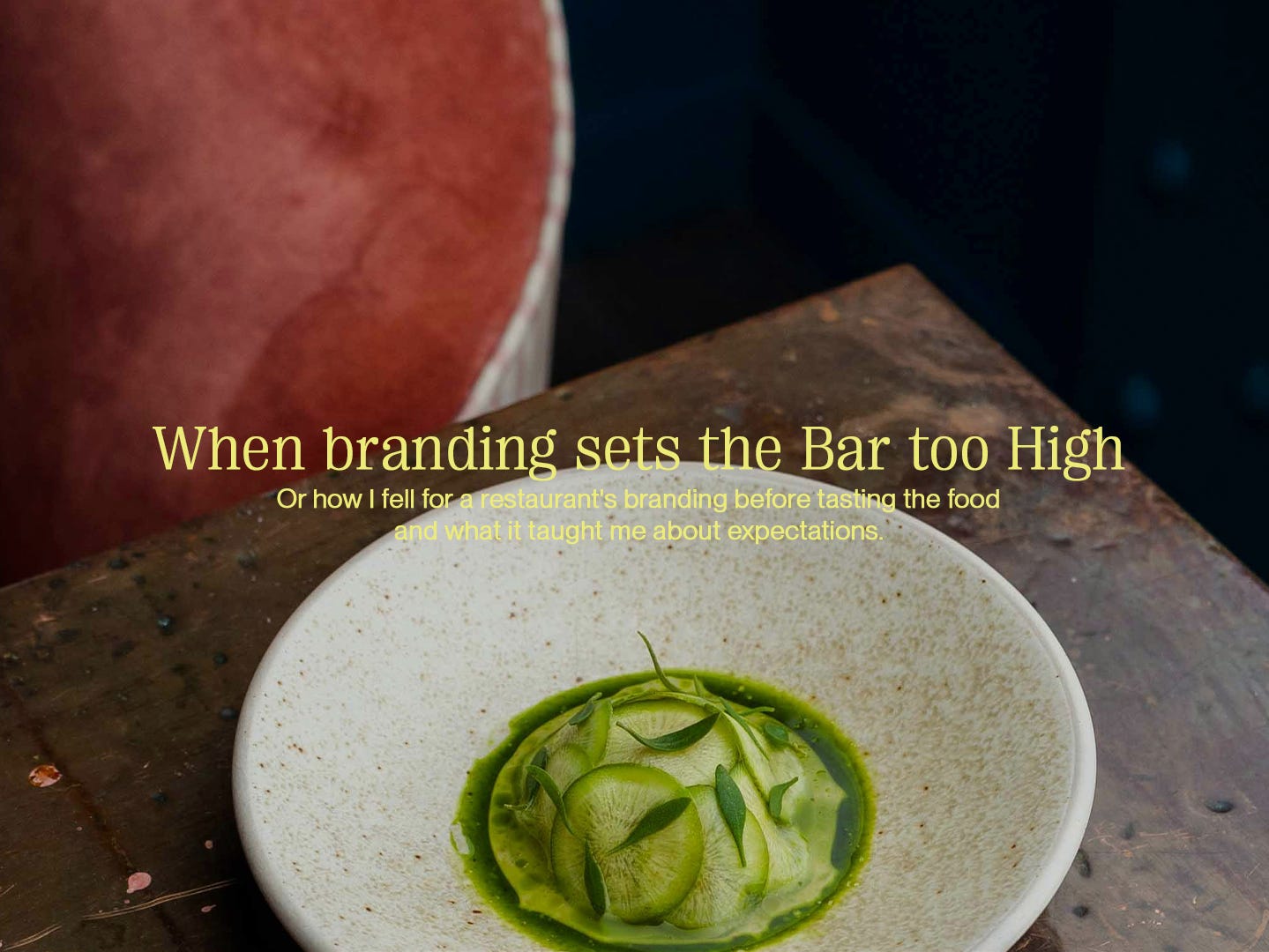
The plates were beautiful. The presentation was on point delicate portions, extra herbs, edible flowers. All fitting for the positioning. And yes, it tasted good. But not exquisite. Not as good as the brand had led me to believe. And I think that’s where my experience dropped.
We paid the (quite elevated) bill. And I’m always happy to pay for a great dinner. But this time, I didn’t feel like I’d had a great one. I felt like I’d had an okay one, in a beautiful space.
On the way home, we talked about it.
What if the restaurant had called itself modern Australian instead of fine dining? Would my expectations have been lower and my experience better? From a branding point of view, I think yes. The positioning, the identity, the whole atmosphere it created a promise. It told a story. And it set the bar very high.
Too high, maybe.
That’s what branding does. It frames the experience before it begins. It makes you feel something before you taste anything. It can elevate something simple into something unforgettable. But it can also make something good feel like a letdown.
It’s a fine line: the space between branding and experience. When they align, it’s magic. But when they don’t? It’s hard to unfeel the gap.
Maybe it’s a matter of timing. Maybe it’s about not dressing the dish before it’s seasoned. Maybe you don’t need to push the story too far before the product is ready to carry it. Because hype has weight. And when the storytelling is heavier than the substance, you can feel it in the room, in the bite, in the aftertaste.
Don’t get me wrong, I love a beautiful identity. I love bold typography, good lighting, mystery, restraint, confidence. But now, I also crave truth. (and like eating a good dinner). I want a brand that feels honest to what’s on the plate, not just the mood board.
As a designer, this experience reminded me: great branding shouldn’t overcompensate. It should reflect. It should amplify what’s already there. Not promise something that isn’t.
Because if the brand looks better than the food… people will notice.
And they’ll remember.
Bon Appétit, À bientôt!
Mary